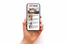
In today’s digital landscape, it’s crucial for businesses to adapt to the growing mobile market. Mobile devices have become the primary source of internet access for many users, making it essential for marketers to optimize their campaigns for mobile platforms. One key aspect of mobile marketing is creating a mobile-friendly banner. In this article, we will discuss best practices for optimizing user experience when creating a banner.
Designing a Responsive Banner
One of the most important factors in creating a mobile-friendly banner is ensuring that it is responsive. A responsive design allows the banner to adapt and fit any screen size or orientation seamlessly. This means that regardless of whether the user is viewing the banner on a smartphone or tablet, it will appear visually appealing and easily readable.
To achieve this, consider using fluid layouts that adjust automatically based on the device’s screen size. Avoid fixed-width banners as they may appear distorted or cut off on certain devices. Additionally, make sure that all elements of your banner, including text and images, are appropriately sized and spaced to ensure readability and aesthetics across different screen sizes.
Keep It Simple and Eye-Catching
When designing a mobile-friendly banner, simplicity is key. Mobile screens are smaller than desktop screens, so cluttered designs can be overwhelming and difficult to navigate. Keep your message clear and concise by using minimal text and focusing on eye-catching visuals.
Utilize bold colors and high-resolution images that grab attention without compromising loading times. Remember that users have limited time and attention span when browsing on their mobile devices, so make sure your message stands out immediately.
Optimize Loading Speed
Mobile users value speed more than ever before. Slow-loading banners not only frustrate users but also negatively impact search engine rankings – making optimization crucial to success.
Optimizing loading speed starts with minimizing file sizes while maintaining image quality. Compressing images and using web-friendly formats, such as JPEG or PNG, can significantly reduce loading times. Additionally, minimize the use of external scripts or plugins that may slow down banner rendering.
Implement Clear Call-to-Actions (CTAs)
An effective mobile-friendly banner should include a clear call-to-action (CTA) that guides users towards the desired action. Whether it’s to make a purchase, download an app, or learn more about a product, the CTA should be easily recognizable and intuitive.
Ensure that your CTA stands out by using contrasting colors and prominent placement within the banner design. Make sure the CTA button is large enough to be tapped easily on touch screens. Implementing interactive elements such as animated CTAs can also grab users’ attention and encourage engagement.
In conclusion, creating a mobile-friendly banner is crucial for optimizing user experience in today’s mobile-first world. By designing a responsive banner with clean visuals, optimizing loading speed, and implementing clear CTAs, businesses can enhance their marketing campaigns and drive better results in their mobile advertising efforts. Embrace these best practices to ensure your banners are not only visually appealing but also effective in capturing the attention of mobile users.
This text was generated using a large language model, and select text has been reviewed and moderated for purposes such as readability.


