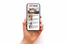
In today’s digital age, newspapers are no longer confined to print. With readers accessing news on a variety of devices, from smartphones to large desktop monitors, it is essential for online newspapers to adapt their layouts accordingly. Responsive design plays a critical role in ensuring that newspaper content is visually appealing and easy to navigate across all screen sizes.
Understanding Responsive Design in Online Newspapers
Responsive design refers to a web development approach that creates dynamic changes to the appearance of a website depending on the screen size and orientation of the device being used. For online newspapers, this means articles, images, advertisements, and navigation menus adjust fluidly so that readers have an optimal experience whether they’re on a mobile phone or a desktop computer.
Key Benefits of Responsive Layouts for Newspapers
Responsive layouts improve readability by organizing content logically and adjusting font sizes for different screens. They enhance user engagement by making navigation intuitive across devices, which helps retain readership. Additionally, responsive designs contribute positively to search engine rankings since search engines favor mobile-friendly websites.
Best Practices for Laying Out Newspapers Online Using Responsive Design
When laying out newspapers online responsively, it’s important to prioritize content hierarchy so headlines and essential stories are prominent regardless of device. Flexible grid systems and scalable images help maintain visual balance without distortion. Incorporating collapsible menus or accordion sections keeps navigation clean on smaller screens while providing full access on larger ones.
Challenges Faced When Implementing Responsive Newspaper Layouts
One challenge is ensuring that complex newspaper features like multi-column articles or embedded multimedia translate well on small screens without overwhelming users. Balancing advertisement placement so it remains effective but unobtrusive across devices can also be tricky. Moreover, maintaining fast load times despite heavier media content requires optimization techniques tailored for responsiveness.
Future Trends in Online Newspaper Layouts with Responsive Design
Emerging technologies such as AI-driven personalization could tailor newspaper layouts dynamically based on individual reader preferences and behaviors. Progressive Web Apps (PWAs) promise more app-like experiences with offline capabilities while still leveraging responsive principles. Additionally, increased use of interactive elements like live updates and multimedia storytelling will continue shaping how newspapers approach responsive design.
In summary, responsive design is indispensable for modern online newspapers aiming to deliver high-quality reading experiences across all devices. By adopting best practices and staying aware of evolving trends, publishers can effectively engage audiences regardless of how they access their news.
This text was generated using a large language model, and select text has been reviewed and moderated for purposes such as readability.